College Majors and its Job Prospects for Vocational Graduates in Multimedia
October 15, 2022
Common Terms Used in The Digital Journalism Major
October 15, 20229 Interesting and Out-of-the-Box Graphic Design Terms
Graphic design terms are getting more and more out of the box. Unfortunately, many interesting graphic design terms sound foreign to ordinary people. Sometimes, for example, if you have a friend who is a graphic designer or majoring in Visual Communications Design (VCD), you may be confused when talking to them as you don’t understand the graphic design terms.
Especially if you ask a graphic designer for help creating a design, when the designer explains, you may be confused and don’t understand. You may be faced with multiple unknown terms in one conversation. Don’t worry, UMN friends; now you don’t have to be afraid anymore. We will share the various graphic design terms. Read along!
1. Lorem Ipsum
We’ll start with the first term, namely Lorem Ipsum. Maybe you’ve seen this term familiar in the design world. According to Id Lipsum, Lorem Ipsum is a text sample in the printing and typesetting industry. That said, Lorem Ipsum is only used as a text template when structuring the design layout to be printed. The goal is simple. It is so that a designer gets an idea about the layout that will be done.
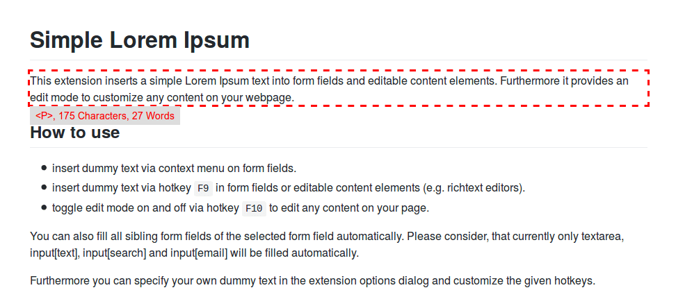
Lorem Ipsum has been the standard sample text since the 1500s. Not only has it lasted up to 5 centuries, but its use has shifted to electronic letters. This phrase is taken from a literary work from the manuscript de Finibus Bonorum et Malorum. In Indonesia, it is also called the Extreme Side of Good and Evil, which Cicero created in 45 BC. The original script was written like this:
“Lorem ipsum dolor sit amet, elite consectetur adipisicing, sed do eiusmod tempor incididunt ut labore et dolore magna aliqua. Ut enim ad minim veniam, quis nastrud exercitation ullamco laboris nisi ut aliquip es ea commodo consquat. Duiis oute irure dolor in reprehenderit in voluptate velit esse cillum dolore eu fugiat nulla pariatur. Excepteur sint occoecat cupidatat non proident, sun in culpa qui officia deserunt mollit anim id est laborum.”
Also read: Getting to know the Department and Tuition Fees for DKV at UMN.
2. Aspect Ratio
Have you ever edited videos or photos through an app? Or maybe you often watch Netflix on your cellphone or computer? Surely you are familiar with the term aspect ratio. Aspect ratio is a projection attribute in the form of a frame that relates the width to the height of the file.
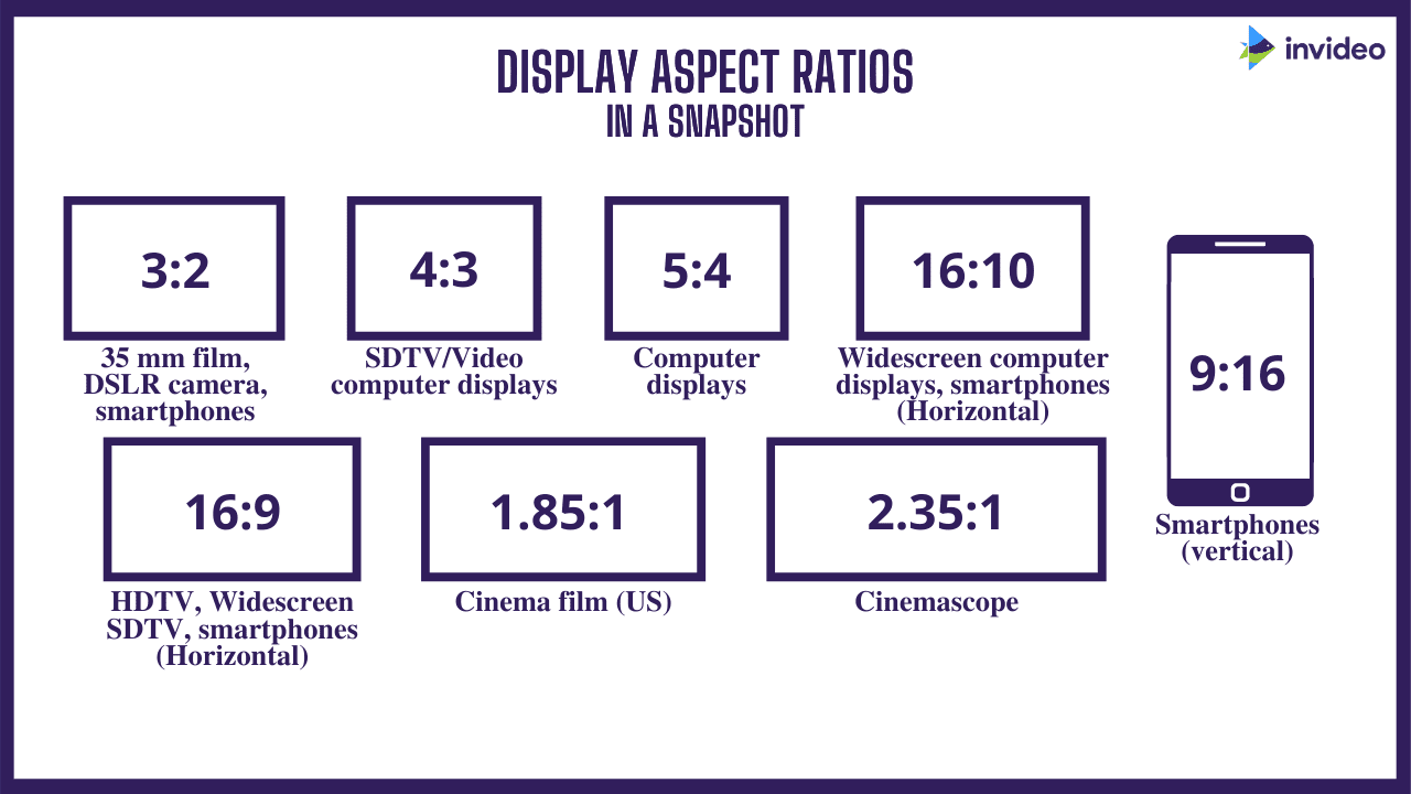
Most frames on the camera, digital video, canvas, designs, and images have a precise angle. An example of an aspect ratio is the frame size of a video you watch on Youtube or Netflix, which usually has a 16:9 ratio. Sometimes, different devices also have different ratios.
3. Embossing
Moving on to the next term, namely Emboss or Embossing. Emboss is a finishing technique that gives an embossed print to the paper’s surface. The reference consists of the protruding part (male) and the concave part (female).
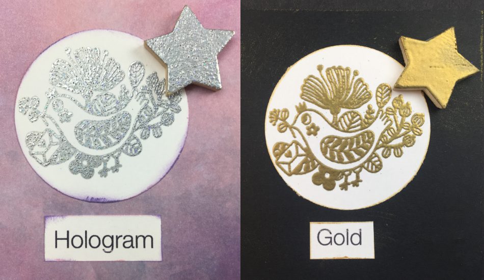
This finishing process is widely used in commercial printing on business cards and for book covers, postcards, packaging, leather, etc. The mold can also be adjusted to the height and depth as needed. When printing on paper media, you can use a type of paper with a thick grammage so that the printouts are more visible.
4. Color Palette
The fourth term is a color palette or color combination. We know that color is a factor in whether or not a display is attractive. Starting from the appearance of mobile apps, websites, or any other design outputs. Therefore, designers usually use a color palette to get the right color combination according to your brand.
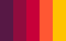
A color palette is a blend of colors combined to produce unique and attractive colors according to the characteristics and identity of a brand. You can choose many colors to create a Color Palette for your business. Not just one but you can also mix several colors according to your needs.
5. OCR
Have you heard of OCR technology yet? This technology is not a new thing. However, the presence of OCR is very helpful in design. OCR stands for Optical Character Recognition. Simply put, OCR refers to optical character recognition technology with image-to-text, a technology that can convert images or images into text form. OCR may remind us of image scanner machines.

However, OCR is different from a scanner because the OCR scan results are not images in JPEG format or PDF files but a text that can be edited. OCR technology is often used to make editing easier. For example, if you have a document and want to edit it digitally, you only need to scan it with an OCR device; the easiest is using a smartphone. When finished scanning, the text in the document can appear on the smartphone and be edited immediately. Cool, isn’t it?
6. Rule of Thirds
The next term is the Rule of Thirds. This term is commonly used in photography and graphic design. The Rule of Thirds is a way to see the layout of a design in the form of a website, painting, photography, or graphic design in pixel lab, Canva or PowerPoint applications.
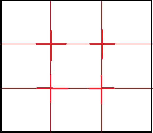
The Rule of Thirds is created by placing a simple grid layout evenly divided into three parts horizontally and vertically in the space used for a design. Make nine squares of the same shape. Artist John Thomas Smith coined the term “Rule of Thirds” in 1797 in his “Remarks on Rural Scenery,” where he recognized the power of dividing a painting using this grid technique to maximize the effect on the beholder’s eye.
7. Knolling
In addition to the Rule of Thirds, there is also another term, namely Knolling. Knolling is a practice of organizing, grouping elements in a field so that they are orderly and precisely positioned so that they are efficient and visually also provide a good aesthetic. In the end, the audience gets a complete picture of what is displayed.

This term was introduced by Andrew Kromelow in 1987 and later used by American artist Tom Sachs. Now knolling has become popular in other fields, such as photography, product design and architecture.
8. Above The Fold
The eighth term is above the fold. This term is usually often found on landing pages. Generally, there are two parts to the page fold (landing page barrier): Above The Fold and Below The Fold. Above the Fold is in charge of holding the user’s attention when they first open a website page.
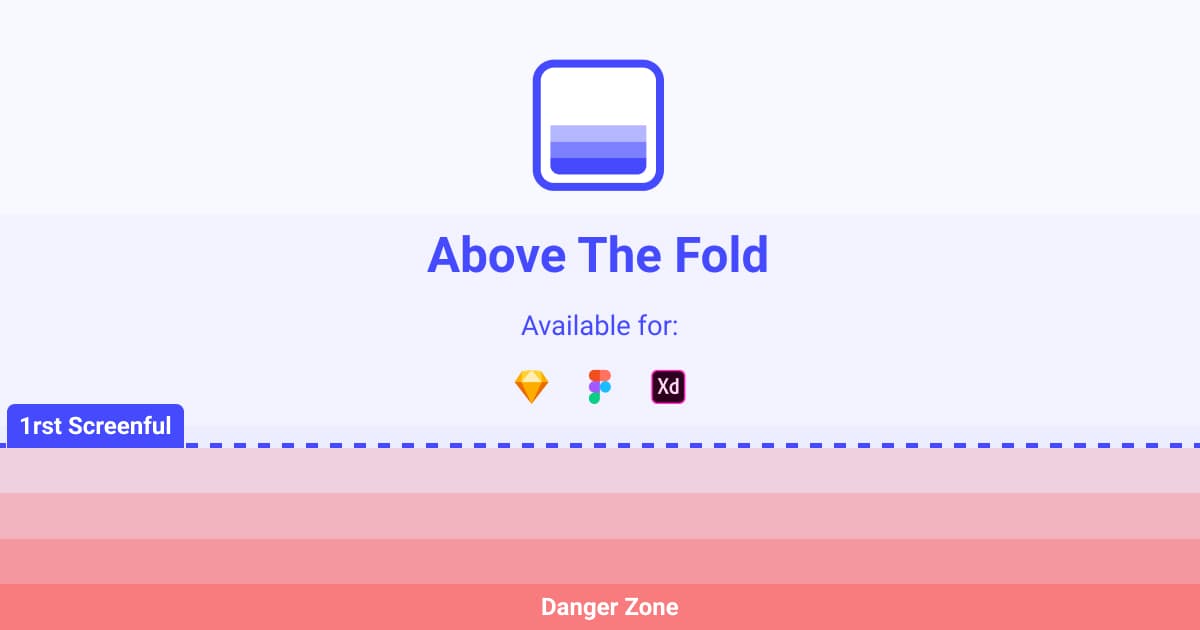
Usually, Above The Fold content will contain images or text that can attract the user’s attention. Website owners will usually place advertisements for products or services. The term above the fold is also used when designing websites. Its function is to refer to a web page’s visible part without scrolling it first.
Also read: Get to know the Department of Business and its Job Prospects.
9. X-Height
The last terms are x-height and line height. The x-height is the distance between the baseline and the mean line. The letter used as a benchmark for lowercase letters is the letter X. The ratio of x-height to the height of a capital letter (aka, baseline-cap line distance) varies. Some text fonts have relatively large heights, such as Georgia and relatively smaller ones, such as Adobe Garamond.
The x-height is one of the important factors for legibility (readability), namely the ease with which a letter can be recognized visually. A large enough x-height—as long as it’s not too big—helps legitimacy, indicating that most letter identities are in the x-height area and lowercase letters. Large x-heights are usually accompanied by fairly high ascender stalks to help distinguish uppercase and lowercase letters to aid legibility.

Meanwhile, an x-height that is too large can actually reduce readability, especially if other factors do not support it. Examples are the Haettenschweiler font, which has a very large x-height (81%) and BerhardFashion, which has a very small x-height (36%). Haettenschweiler, for example, if used as a text font, will be very burdensome to the eye because, apart from the x-height factor, the letters are indeed narrow, the strokes are too thick, and the lettering is boxy, making it difficult to distinguish between curved and angled letters.
There you go! Those are a series of interesting and out-of-the-box graphic design terms. Although the terms are predominantly in English, I hope with the explanation above, you can understand what the terms mean. If you ever feel confused with the terms, you can always refer back to this article!
If you are interested in studying in the Visual Communication Design department and want to learn more about design, especially graphic design, you can check out UMN!
By Reyvan Maulid
English translation by Levina Chrestella Theodora
Kuliah di Jakarta untuk jurusan program studi Informatika| Sistem Informasi | Teknik Komputer | Teknik Elektro | Teknik Fisika | Akuntansi | Manajemen| Komunikasi Strategis | Jurnalistik | Desain Komunikasi Visual | Film dan Animasi | Arsitektur | D3 Perhotelan , di Universitas Multimedia Nusantara. www.umn.ac.id
